.webp)

When a company misses earnings by two percent, analysts want answers on the call. Here is the uncomfortable version of that question: the world's largest public companies are collectively losing about 2% of EBITDA every single year to physical climate hazards, and it appears on no earnings call, in no guidance, and in almost no valuation model.
It is roughly costing the global corporations about $153 billion a year, and it does not arrive as a catastrophe. It accumulates as ordinary weather doing ordinary damage: a flooded distribution hub offline for a week, a heat wave curtailing a plant, a storm that never makes the news closing a hundred stores for two days. No single event moves a stock. The sum quietly taxes the entire market.
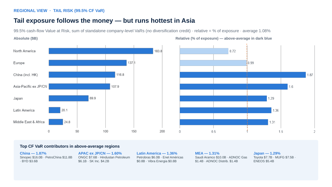
And that is a good year. In a 1-in-200 climate year/VAR 99.5, the cash flow at risk across these companies sums to roughly $660 billion, more than four times the ordinary-year figure. For dozens of household-name industrials, that single year erases more than a full year of earnings. Expected loss is pricing input; the tail is where covenants, ratings, and solvency live.
Most of the market cannot see any of this, because most climate analytics stop at hazard scores and headquarters coordinates. At Jupiter Intelligence, we built Jupiter Entity Modeling to answer what scores cannot: not whether a company is exposed, but what the exposure costs. We mapped more than 2,700 companies across the S&P 500, Russell 1000, and MSCI ACWI to over 2.1 million geolocated assets: refineries and fabs, but also the retail networks and distribution centers most exposure datasets miss. Each footprint is modeled for flood, wind, wildfire, and heat under SSP2-4.5 today and SSP5-8.5 through 2070.
Four findings stand out.
1. The bill lands on heavy industry. Intensity is not size
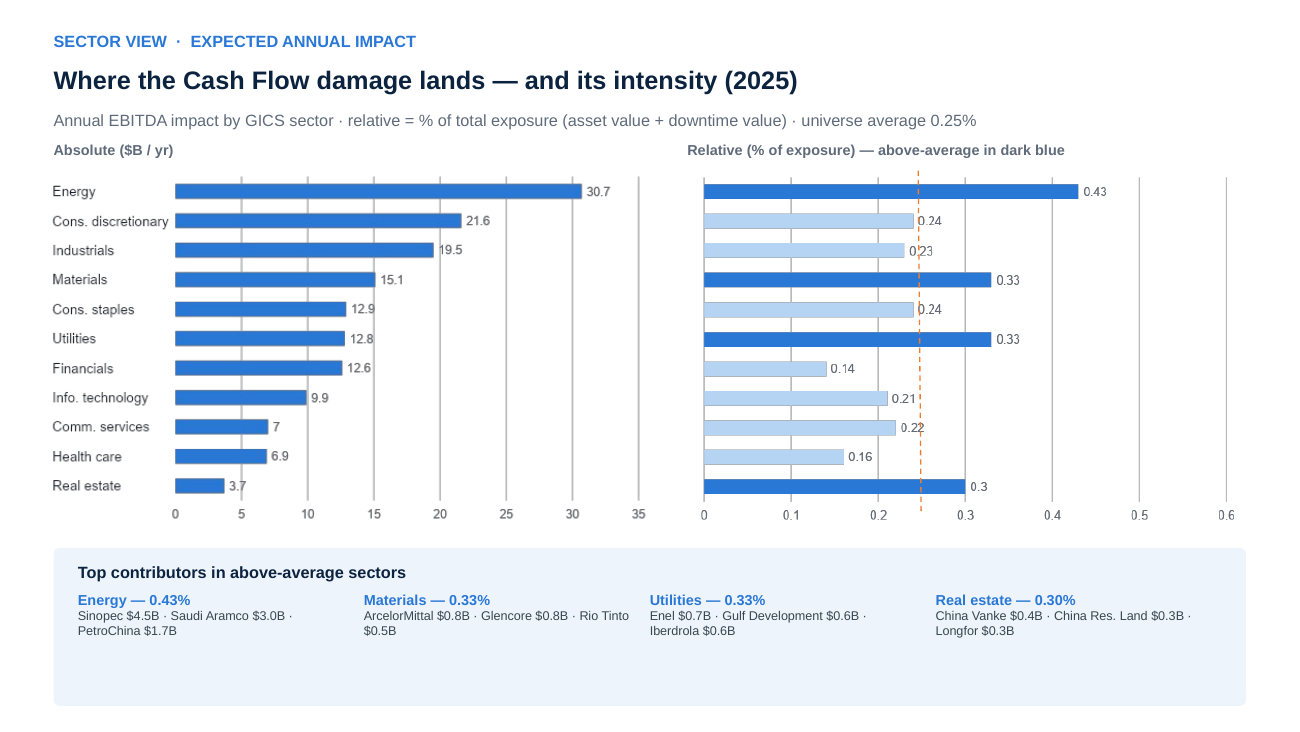
Energy carries the largest absolute impact: about $31 billion a year across just 89 companies, led by Sinopec, Saudi Aramco, and PetroChina. But absolute rankings mostly reflect who owns the most assets. The sharper question is intensity, meaning earnings impact per dollar of exposed value, and there energy, materials, and utilities lead, the sectors whose heavy, fixed, weather-exposed assets convert value at risk into loss fastest.
Geography splits the same way. North America holds the biggest bill, about $42 billion a year, yet converts its exposure at the lowest rate of any region. The intensity leaders are Latin America (Petrobras, plus wind-exposed footprints on thin margins) and China. Asia-Pacific broadly runs two to three times North American intensity.
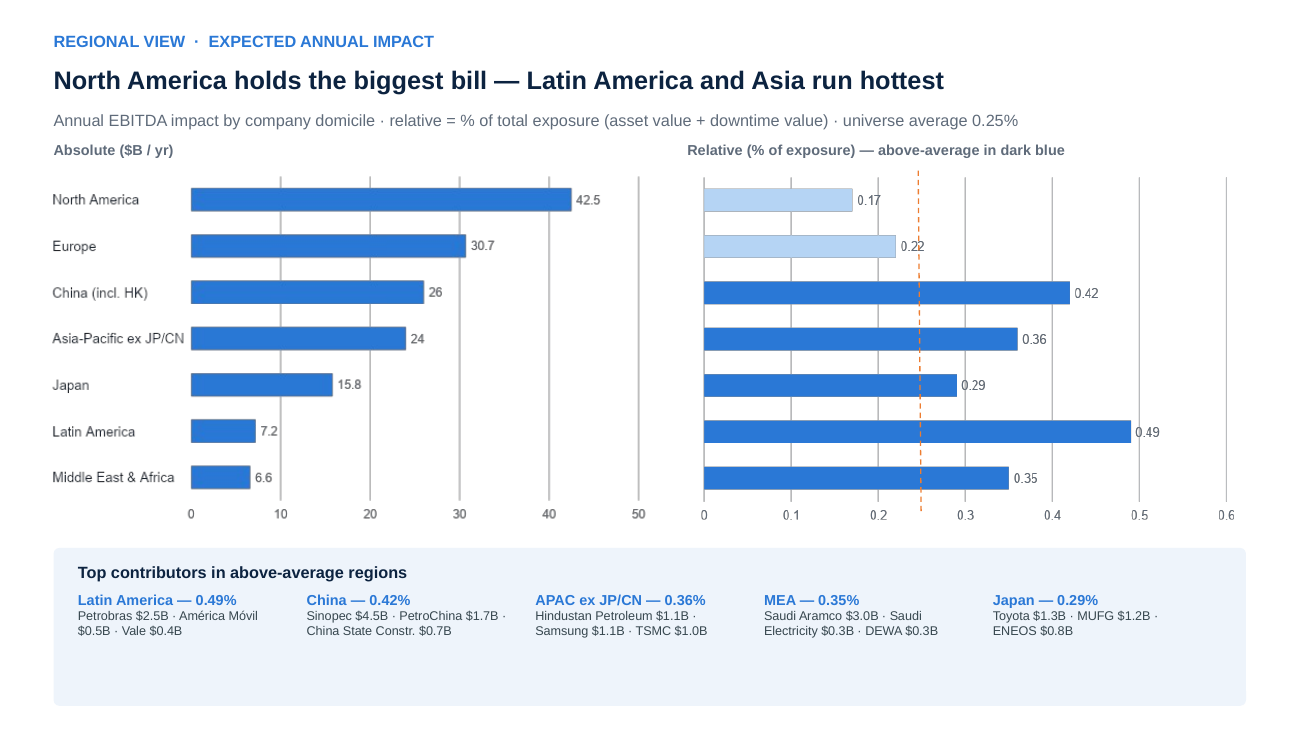
Absolute tells you where the dollars are. Intensity tells you where the risk is. You need both.
2. The ranking depends on the question
Rank sectors by loss per dollar of physical assets, and one ordering emerges. Rank by loss per dollar of revenue, another. Rank by earnings impact per dollar of complete exposure, physical value plus the interruption value at risk, and a third. In our universe, the choice of exposure base alone moves a major global sector from first place to ninth. The culprit is business interruption: it dominates the loss, so counting it in the numerator but not the denominator misranks every asset-light sector.
None of these lenses is wrong. An insurer, a lender, and an equity analyst are asking different questions of the same physical reality. The failure mode is compressing them into one score, which silently answers the question for you. It's why Jupiter Entity Modeling publishes the full metric stack instead. The compression is where the information dies.
3. Geography is the signal that holds, for now
Sector rankings move with the metric. Geography doesn't. Under every lens we applied, Asia-Pacific and Latin American intensities run two to three times North American levels. Regional exposure is a stable, decision-grade signal in a way single-metric sector screens are not.
4. Under high emissions, the map converges
Then we turned the clock forward, and the stability broke.
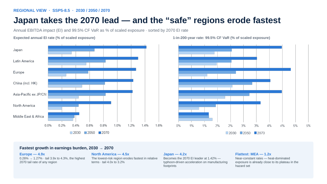
Under SSP5-8.5, the universe's earnings burden grows 3.7x by 2070 and the tail rate 2.7x. The composition shifts are the real story. Consumer discretionary compounds 6.6x and overtakes energy as the most exposed sector by 2070. Global auto and retail supply chains grow fastest, with the steepest tail climb of any industry. Health care jumps from near-bottom to mid-pack. And the “safe” regions erode fastest: Europe grows nearly 5x, North America 4.5x, and by 2070 Europe carries the highest tail-risk rate of any region while Japan takes the overall lead. The gap between the riskiest and safest regions shrinks decade by decade.
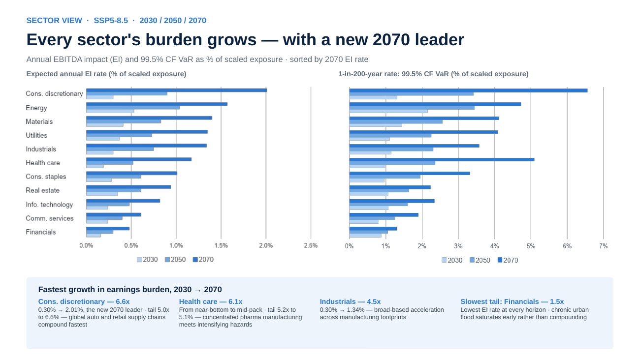
Say it plainly: under high emissions, geography stops protecting you. Regional diversification, the default physical-risk defense, weakens on exactly the pathway where it's needed most. A snapshot can't show you that. The trajectory is the finding.
Five questions to ask any climate analytics provider
1. Asset by Asset with Financial Materiality? Proxying through HQ coordinates or just hazard scores is not enough. Materiality starts with what the company owns and operates.
2. Absolute or intensity? They point to different places. Demand both.
3. Which financial question does the ranking answer? And is interruption counted on both sides of the ratio?
4. Expected year or tail year (VAR)? The tail runs 4x the mean and elevates different sectors.
5. Snapshot or trajectory? The 2070 ranking is not the 2030 ranking.
Physical climate risk is not a uniform tax. It is concentrated, metric-sensitive, and time-dependent: $153 billion a year today, $660 billion in a bad year, compounding fastest where things currently look safest. The capability to see it company by company, asset by asset, exists now. Using it well means asking the right financial questions, which is exactly what we built Jupiter Entity Modeling to answer.
Request a demo
Want to see what this looks like for your portfolio? Request a demo of Jupiter Entity Modeling and see your counterparty exposure — company by company, asset by asset.
About the author:
Wahib Ghazni, leads Economic & Financial Modeling at Jupiter Intelligence and heads the Jupiter Entity Modeling product, linking corporate asset footprints to financial outcomes. He holds a PhD in Finance; his research focuses on translating physical climate risk into financial outcomes, spanning earnings impact, valuation, and tail risk. Figures are aggregate model estimates under stated scenarios, not investment advice.
